Painting brick—whether it’s a fireplace, accent wall, or the exterior of your home—is a big decision. Unlike smooth drywall or siding, brick has texture, depth, and personality. Pick the right color, and it highlights its charm; pick the wrong one, and it can flatten the character you worked so hard to preserve.
1. Consider Your Home’s Style
Not every brick surface should be white. Your paint color should “speak the language” of your architecture:
- Classic Homes: Off-whites, warm taupes, and charcoal grays honor the traditional look while giving a modern refresh.
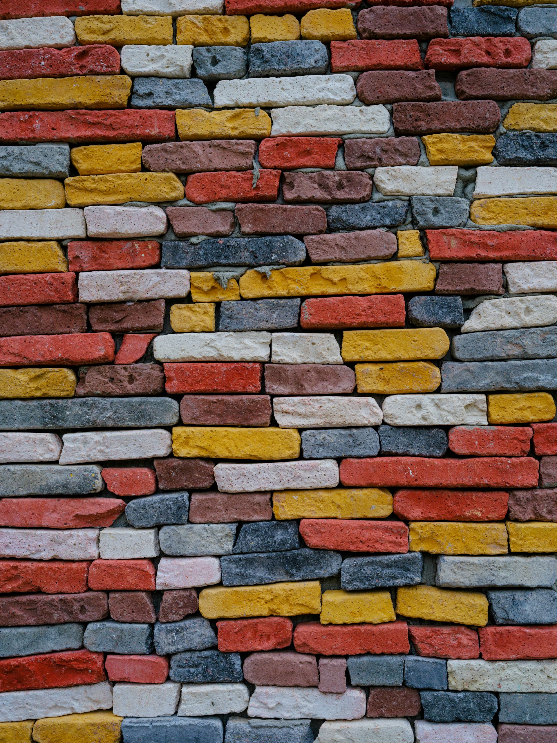
- Contemporary Builds: Crisp black, slate blue, or bold forest green add dimension and edge.
- Cottage or Craftsman Styles: Sage greens, creamy beiges, and muted blues feel cozy and inviting.
Your brick may be old—but your palette doesn’t have to be.
2. Account for Lighting and Surroundings
Natural light dramatically affects how brick paint looks. What’s soft ivory in morning sun might look glaring at noon.
- Sun-drenched exteriors: Stick to warm gray, greige, or ivory to avoid harsh glare.
- Shaded areas: Deep navy, olive green, or burgundy add cozy depth.
Also, consider landscaping and surroundings: trees and greenery pair beautifully with earth tones, while urban settings may benefit from crisp contrasts.
3. Embrace Brick Texture
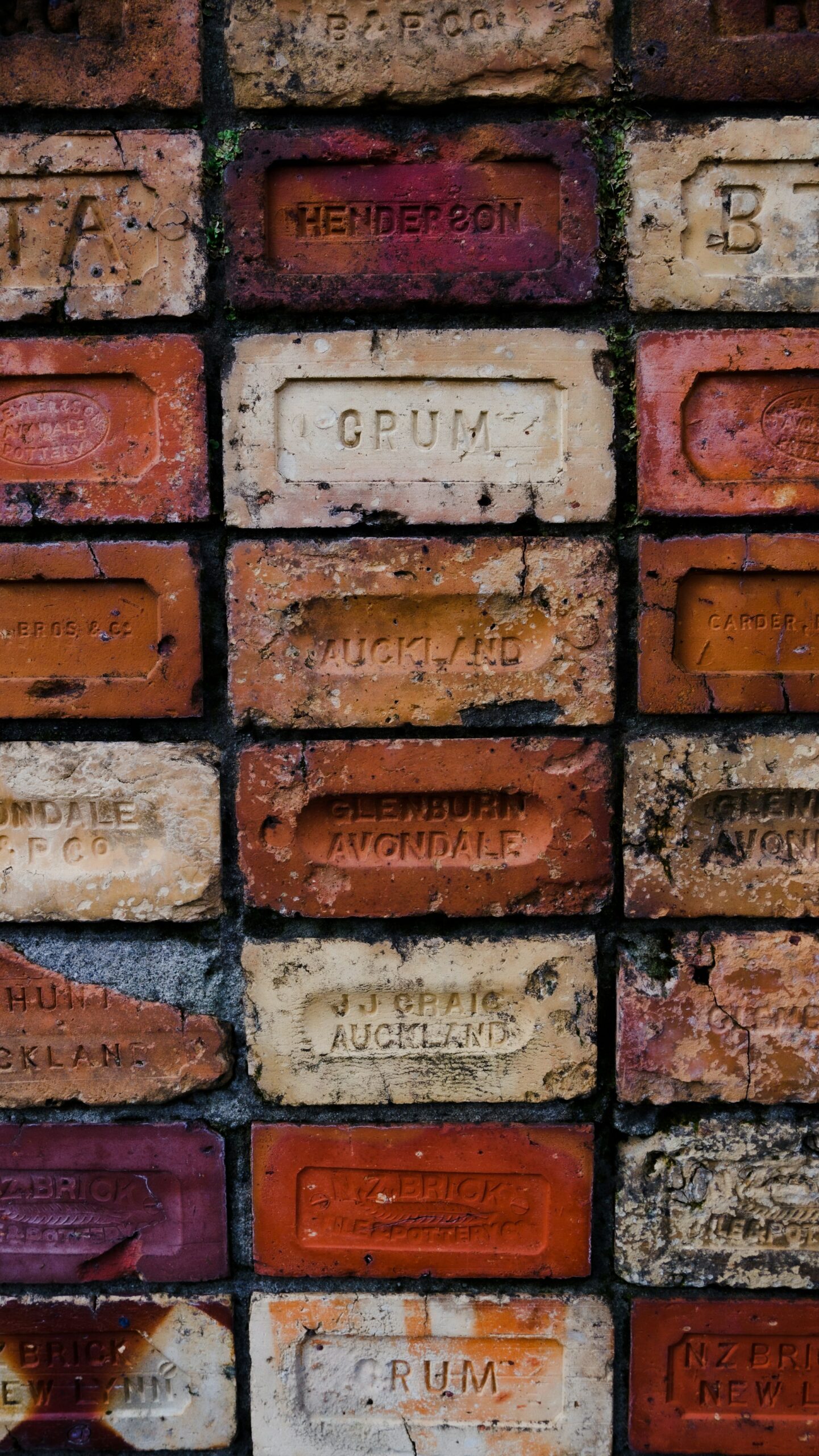
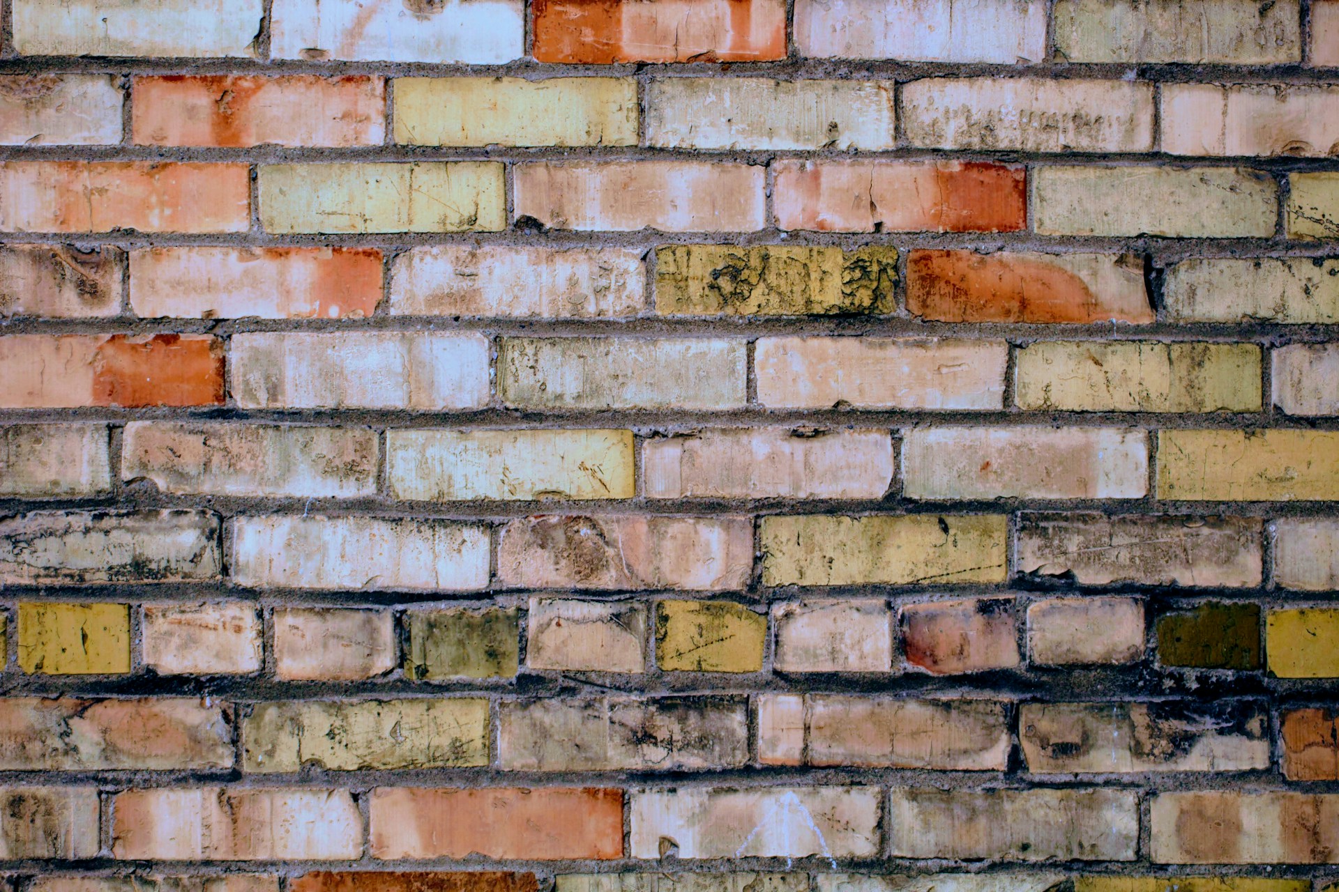
Brick isn’t flat, so paint interacts differently than on wood or drywall. Thin layers preserve its dimensionality, while thick coats can erase its natural charm.
Techniques like whitewashing or limewashing offer a breathable, organic look that keeps the texture visible while refreshing the color.
4. Trending (But Timeless) Colors
Some shades consistently perform well, no matter the trend:
- Warm White: Classic, versatile, brightening without being sterile.
- Charcoal or Soft Black: Bold, sophisticated, perfect for modern homes.
- Muted Olive or Sage: Grounded and earthy—great for cottage or rustic vibes.
- Greige (Gray + Beige): A neutral hero that pairs with both warm and cool accents.
- Dusty Blue or Navy: Moody yet inviting; complements brass, copper, and wood.
Remember: trends like bold teal may look fun on Pinterest, but consider your surroundings, neighborhood, and resale value. Subtle impressiveness beats fleeting shock value.
5. Don’t Forget the Trim
Brick color is only one piece of the visual puzzle. Trim can complement or clash depending on your choices:
- White brick + black trim = timeless contrast
- Gray brick + wood-toned trim = warm, contemporary style
- Beige brick + cream trim = soft, elegant look
Color harmony matters—but a touch of personality never hurts.
Read More : what-color-to-paint-brick/
Final Thoughts: It’s About Character, Not Just Color
Painting brick isn’t just about updating a surface—it’s about shaping the visual identity of your space. Test swatches, view them at different times of day, and consider how they make you feel. The right color can make your home feel fresh, refined, and unmistakably yours.
Pro Tip: Always use masonry-specific paint. Regular paint might hold up temporarily, but over time it can peel, bubble, or trap moisture. A breathable masonry paint preserves the brick’s health while keeping it beautiful.








1 Comment
Hi, this is a comment.
To get started with moderating, editing, and deleting comments, please visit the Comments screen in the dashboard.
Commenter avatars come from Gravatar.